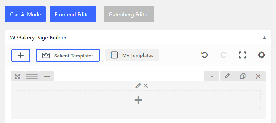
To open up the row settings, click on the pencil icon.
Structure
Spacing & Content
Background
Shape Divider
Color Overlay
Structure
Row Type
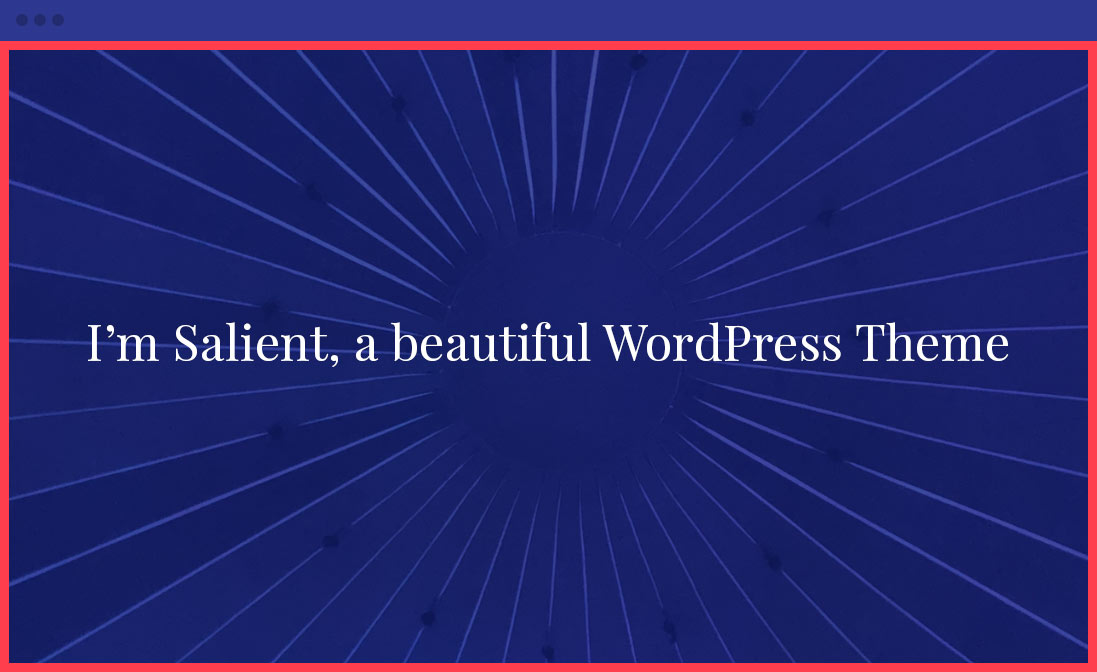
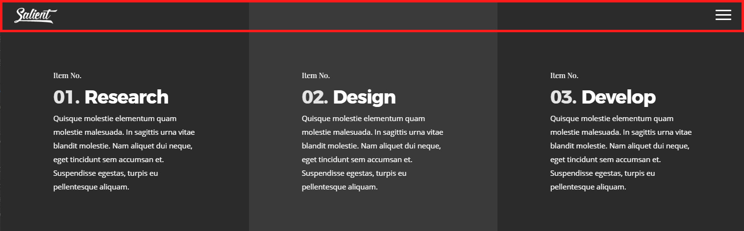
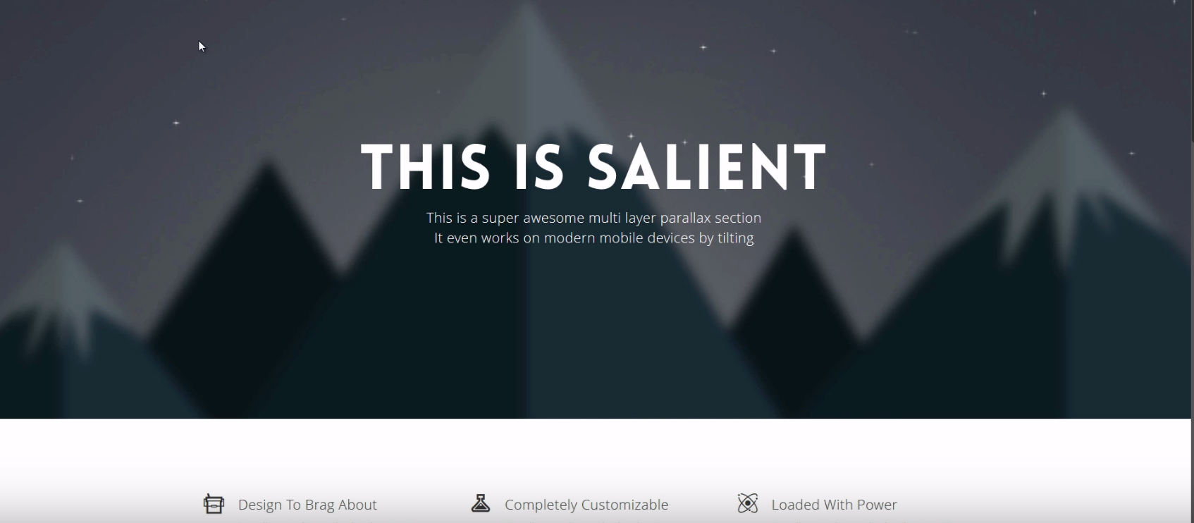
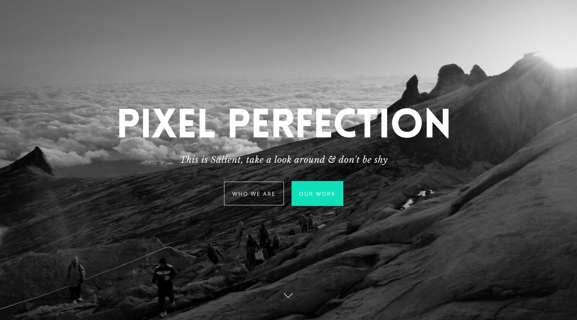
The row type will control the sizing of your row content and row background layers. Below we will compare each of the available row types. The red highlight is a representation of the content area.
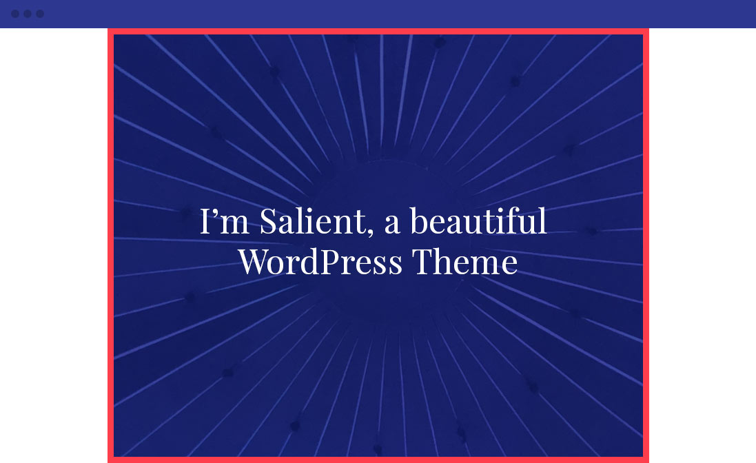
Row Type: In Container
The “in container” row type will constrain the background layer as well as the content. This row type also adds a small bit of bottom margin by default, so if you’re looking to make your rows flush against each other, use one of the other two types.

Row Type: Full Width Background
This row type allows the background supplied for the row to stretch to the edges of the browser window, but keeps the content inside constrained in the main content container.
Row Type: Full Width Content
This is a row set to the “Full Width Content” type with a background color. It allows both the row background and any content inside it to display the full width of the browser window.
Column Margin
The column margin allows you to define the amount of spacing between each of the columns in your row.
20px Margin
Lorem ipsum dolor sit amet, consectetur adipiscing elit. In eget eros molestie, iaculis.
20px Margin
Lorem ipsum dolor sit amet, consectetur adipiscing elit. In eget eros molestie, iaculis.
20px Margin
Lorem ipsum dolor sit amet, consectetur adipiscing elit. In eget eros molestie, iaculis.
50px Margin
Lorem ipsum dolor sit amet, consectetur adipiscing elit. In eget eros molestie, iaculis.
50px Margin
Lorem ipsum dolor sit amet, consectetur adipiscing elit. In eget eros molestie, iaculis.
50px Margin
Lorem ipsum dolor sit amet, consectetur adipiscing elit. In eget eros molestie, iaculis.
80px Margin
Lorem ipsum dolor sit amet, consectetur adipiscing elit. In eget eros molestie, iaculis.
80px Margin
Lorem ipsum dolor sit amet, consectetur adipiscing elit. In eget eros molestie, iaculis.
80px Margin
Lorem ipsum dolor sit amet, consectetur adipiscing elit. In eget eros molestie, iaculis.
Equal Height
Allows you to keep the columns within your row at an equal height regardless of how much content is in them. To make this noticeable, a background of some sort would need to be set on the column. You can also choose how the shorter content will be aligned (top,middle,bottom).
Equal Height Enabled
Lorem ipsum dolor sit amet, consectetur adipiscing elit. Aenean ac ex a enim dapibus imperdiet. Morbi laoreet ipsum vitae suscipit consectetur. Suspendisse varius nulla id augue imperdiet, ac luctus purus fringilla. Sed accumsan tristique nunc eget tincidunt. Phasellus tincidunt elementum pharetra. In et tincidunt lorem.
Lorem ipsum dolor sit amet, consectetur adipiscing elit. Aenean ac ex a enim dapibus imperdiet. Morbi laoreet ipsum vitae suscipit consectetur. Suspendisse varius nulla id augue imperdiet,
Equal Height Disabled
Lorem ipsum dolor sit amet, consectetur adipiscing elit. Aenean ac ex a enim dapibus imperdiet. Morbi laoreet ipsum vitae suscipit consectetur. Suspendisse varius nulla id augue imperdiet, ac luctus purus fringilla. Sed accumsan tristique nunc eget tincidunt. Phasellus tincidunt elementum pharetra. In et tincidunt lorem.
Lorem ipsum dolor sit amet, consectetur adipiscing elit. Aenean ac ex a enim dapibus imperdiet. Morbi laoreet ipsum vitae suscipit consectetur. Suspendisse varius nulla id augue imperdiet,
Column Direction
Allows you to control the direction in which your columns will flow in the document. This option can be set to a different value for desktop/tablet/smartphone displays, which opens up powerful layout possibilities.
Standard Direction
1
First Column
2
Second Column
3
Third Column
Reversed For All Viewports
1
First Column
2
Second Column
3
Third Column
Reversed For Mobile Only (Shrink your browser window)
1
First Column
2
Second Column
3
Third Column
Full Height Row
This will cause your row to automatically scale to the height of the browser window. When using this option, there’s no need to set any padding for the top/bottom of your row, as doing so will increase the height of your row beyond the height of the browser window.

Spacing & Content
Padding
The padding fields will accept standard numerical values such as “100” to use a px, or will accept % based values, such as 10%. Using padding will help give the content nested inside the row breathing room and allow the background layer of your row to show more.
Device Groups
The three icons next to the field name allow you to define separate values for the desktop/tablet/smartphone views.
Lock Icon
Locking the top/bottom or left/right fields together will ensure that their values remain the same for easy proportional editing.

No padding added
Lorem ipsum dolor sit amet, consectetur adipiscing elit. Aenean ac ex a enim dapibus imperdiet. Morbi laoreet ipsum vitae suscipit consectetur. Suspendisse varius nulla id augue imperdiet, ac luctus purus fringilla. Sed accumsan tristique nunc eget tincidunt. Phasellus tincidunt elementum pharetra. In et tincidunt lorem.
10% padding top/bottom, 20% padding left/right
Lorem ipsum dolor sit amet, consectetur adipiscing elit. Aenean ac ex a enim dapibus imperdiet. Morbi laoreet ipsum vitae suscipit consectetur. Suspendisse varius nulla id augue imperdiet, ac luctus purus fringilla. Sed accumsan tristique nunc eget tincidunt. Phasellus tincidunt elementum pharetra. In et tincidunt lorem.
Transform
Allows you to move the row from its current position (according to the parameters given for the X-axis and the Y-axis). Translating X or Y does not affect the flow of the rest of the document. Similar to padding, these values can be set separately for the desktop/tablet/smartphone viewports.
Above is an example of a row using 30px for the X and 30px for the Y transforms. The dimmed version of the row denotes the original position, before using transforms.
Text Color
This allows you to set the row text to display as dark (default) or light for the text color.
This setting is also tied to the permanent transparent header theme option. When using that theme option, the transparent header navigation color will change its color based on what your row color is set to. Example below.
“Permeant Transparent” header passing by a row with light text color
“Permeant Transparent” header passing by a row with dark text color
Background
Background Layers
The stacking order for the background layer can be seen in the illustration below.
- Elements place inside the row (top)
- Shape Divider Layer
- Color Overlay Layer
- Background Image/Video Layer
- Background Color (bottom)

Background Image
You can add a background image to any row by using the “Upload image” button in the background tab of your row settings. Once an image is supplied, some new options will appear which relate to the display of your background image.
- Background Image Mobile Hidden: Allows you to optionally remove the background image from displaying on mobile devices (when the browser window is less than 1000px wide). This can be useful if you wish to simply your row styling to only use a background color, when the users screen size is smaller.
- Background Position: Define an alignment for your background image within the row. By default, the image will be anchored to the left top of the row.
- Background Repeat: If you’re trying to use a pattern that is meant to repeat, you change this option to “repeat”. If a standard image is uploaded, leave this as no-repeat. When no-repeat is selected, the background size of your row will use the CSS value “cover” to automatically scale image to fit your row and leave no excess space.
Video Background
- Video Color Overlay: (Legacy option). Allows you to specify a color overlay that will go on top of your video background. For users above version 9 of Salient, you can use the more powerful color overlay tab in the row options instead.
- YouTube Video URL: You can supply a URL from YouTube to populate your video BG if you don’t want to self host it. However, note that with this option, there is no possibility of mobile playback. If you would like your video background to also play on mobile, you must use the self hosted option instead.
- WebM File URL: If you’re self hosting, you must supply this format to ensure cross browser compatibility.
- MP4 File URL: If you’re self hosting, you must also supply this format to ensure cross browser compatibility.
- OGV File URL: Optional file format to supply for self hosting
- Video Preview Image: The image that will be used in place of your video BG on mobile devices. This is only used when you have the Salient theme option “Disable Video Backgrounds On Mobile Devices” activated. (Salient options panel > general settings > functionality tab).
Troubleshooting self-hosted video background playback
Videos won't play on desktop or mobile
Ensure that your server is capable of parsing video files. Some servers require you to add the media types supported in the .htaccess file in order for them to parse the files. Open up your .htaccess file located at the root of your WordPress install and add this in:
AddType video/mp4 .mp4
AddType video/mp4 .m4v
AddType video/ogg .ogv
AddType video/webm .webm
AddType video/webm .webmv
If unsure that your server is configured to playback videos correctly, try inputting a video hosted from ThemeNectar and test playback:
https://themenectar.com/videos/video-test.mp4
Ensure that your videos are correctly encoded for web playback. If you’ve added the media types to your server and are still running into difficulty, please run your videos through these converters:
http://video.online-convert.com/convert-to-mp4
http://video.online-convert.com/convert-to-webm
Videos won't play on mobile or Safari only
Ensure that a power-saving or data-saving mode is not on: If a power-saving mode is active, it will prevent ANY video from auto-playing. Because of this, it’s recommended to still supply a fallback image for these instances.
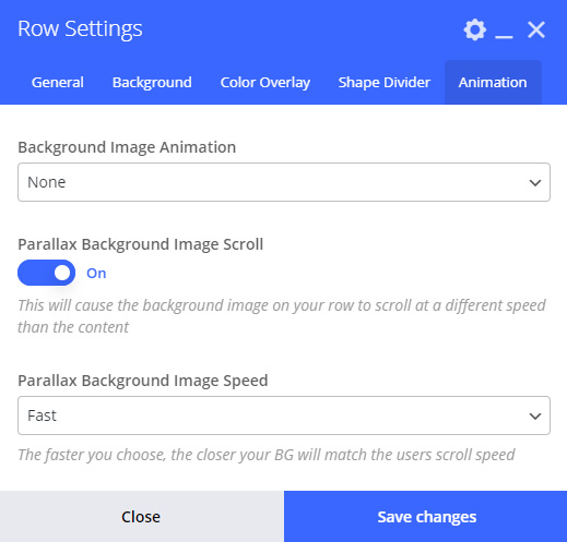
Mouse Based Parallax
Allows you to add multiple background layers to your row which will respond at different sensitivity to mouse movement, creating a parallax effect. When activating this option new inputs will open up for you to configure the effect.
- Scene Positioning: The general alignment of the parallax images.
- Scene Parallax Overall Strength: How much the scene will respond to mouse movement.
- Scene Layers One-Five: The inputs to upload the images for each scene.
Video Tutorial
Shape Divider
Shape Divider Type
Shape Dividers are optional parts of the row background layer which can add exciting design possibilities. A shape divider will not display in your row background unless the “Enable Shape Divider” option is activated.
The shape divider selection icons demonstrate the shape that will be applied to your row backed. The white area within the icon represents the actual SVG shape to be applied, and the blue represents the row background.

Shape Divider Position
This determines whether the shape divider layer will be added to the top or the bottom of your row.
The shape divider layer does not contribute to the height of your row. The height that you set for it should be based on the existing height of your row.

Bottom Position

Top Position
Bring to Front
By default, the shape divider will positioned underneath the content in your row. If you would like to bring it to the front of your row, and have it clip everything inside the row, you can use this option.
Below is an example of the “bring to front” option being toggled on a row that uses a text block and an image element its content.

Bring to Front Disabled

Bring to Front Enabled
Video Tutorial
Color Overlay
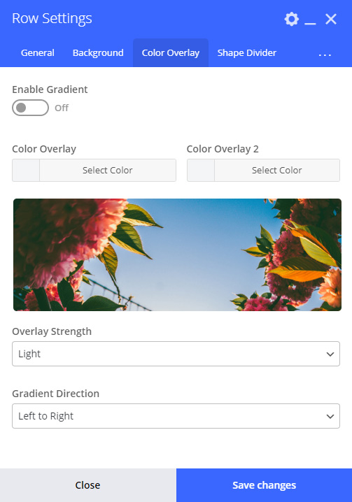
Gradient Direction
Controls which way to render the gradient – A preview will be shown in the overlay tab.

Left to Right

Left Bottom to Right Top

Left Top to Right Bottom

Bottom to Top
Animation
Advanced


Row ID
Allows you to define a custom ID for your row. This field is most used when creating anchor links to specific rows on a page. For example, you could add an ID onto your row named “about”, and then set a link URL to “http://domain/page/#about” from a menu item or a button on the page. The link added will now lead directly to that row when navigated to.
For more detailed information on anchor linking, check out the video tutorial below.
Disable Row
Removes the row from displaying on the front of your website, but keeps the row content in the backend. A fast way to see what your design would look like without a specific row without actually having to delete it or move it elsewhere.