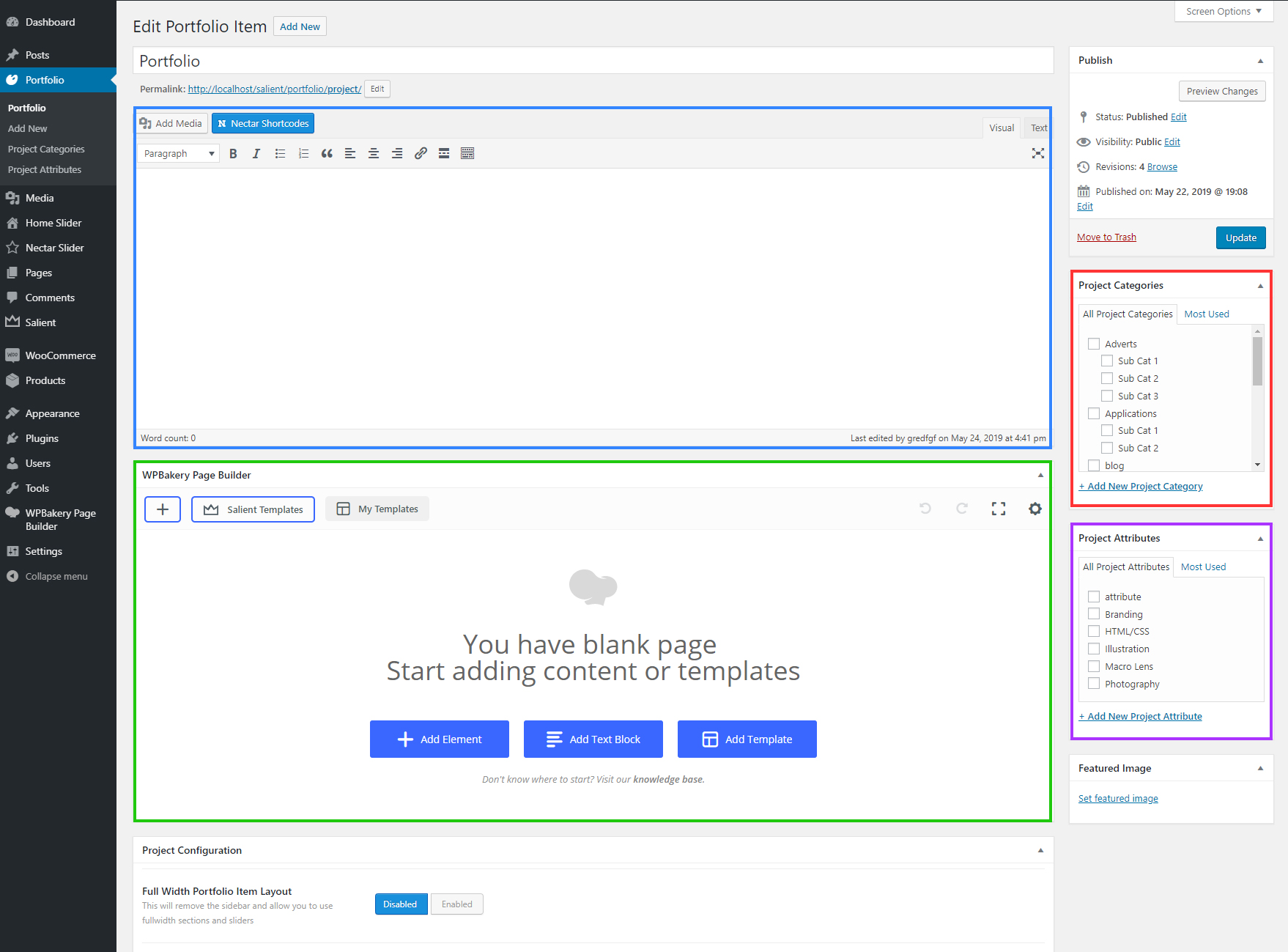
Creating projects within the portfolio post type is similar to creating pages/posts. Below we will cover what all the areas within a project creation page are for.
- First Editor: Populates the sidebar content for your single project layout. This editor will be hidden (as it is not used) when the option “Full Width Portfolio Item Layout” is activated in the project configuration metabox.
- Second Editor: This is where your main project content will live. This editor also has access to the Salient WPBakery Page Builder.
- Project Categories: The main way to group your projects. The categories here will be available to show as filters when displaying a portfolio element.
- Project Attributes: The secondary taxonomy to group projects together. Currently there is no option to display these in filters for users, however you can link to directly to each attribute by using the URL domain.com/project-attributes/your-attribute
Portfolio Page Builder Element Settings
The following are options available for the portfolio page builder element. They will control how the portfolio grid will display.
- Layout: Determines the column formatting of your portfolio instance. If you choose the “Fullwidth” or “Fullwidth Constrained” option, the below masonry option will behave differently and use the “Masonry Item Sizing” which is set on a per-project basis.
-
Project Style: Sets the style that the projects within the current portfolio instance will use. See examples below:


Meta on hover + entire thumb link
Meta on hover w/ zoom + entire thumb link

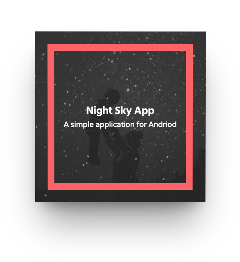
Title overlaid w/ zoom effect on hover

Meta from bottom on hover + entire thumb link

Meta Overlaid – Bottom Left Aligned
Meta + 3D Parallax on hover
-
Item Spacing: Allows you to control the space between each project within the portfolio grid.
- Masonry Style: This will allow your portfolio items to display in a masonry layout as opposed to a fixed grid.
- Bypass Image Cropping: Enabling this will cause your portfolio to bypass the default Salient image cropping which varies based on project settings/above layout selection. The result will be a traditional masonry layout rather than a structured grid.
-
Enable Sortable: This will add category filters for users to sort projects.
-
Horizontal Filters: Changes the default filter dropdown into horizontal filters.
-
Filter Color Scheme: Alters the coloring of the portfolio filters.
-
Enable Pagination: Adds pagination to the portfolio instance. Recommended when displaying a lot of projects.
-
Projects Per Page: Determines how many projects to display on each page of a paginated portfolio. If pagination is not enabled, the portfolio will simply show this number of projects.
-
Project Offset: Offsets a portfolio query to skip x amount of projects.
-
Lightbox Only: This will remove the single project page from being accessible thus rendering your portfolio into only a gallery.
-
Load In Animation: Optionally shows each project with an animation when scrolled into view.
Portfolio Project Metabox Settings
The following are options that unique for each project. You can find them in metaboxes when editing a project at the bottom, below the content editor.
Project Configuration
- Full Width Portfolio Item Layout Enabling this option will remove the default WP editor for the project (which is used to populate the sidebar area) and leave only the Extra Content editor which will now display the full width of the project container. This editor will also have access to the Salient Visual Composer page builder.
- Custom Content Grid Item This will allow you to place custom content in your portfolio grid using a simple editor that will appear. By default, the project title and date (or custom except) are shown each project, but this will allow you to place any content you desire e.g. a Nectar shortcode. By using this option, the single project page will also be disabled for the project.
- Custom Thumbnail Image If an image is supplied for this field it will be used instead of the regular Featured Image. No cropping will occur so make sure you’re keeping track of the aspect ratio or else you could end up with unexpected layouts.
- Hide Featured Image/Video on Single Project Page? By default the featured image you supply is also shown in the single project page at the top, enable this option to remove it.
- Masonry Item Sizing This will set the size of your project when using a portfolio element set to a masonry enabled layout. For more details on what these sizes will display as, see the “Masonry Grid Sizing” section of the documentation.
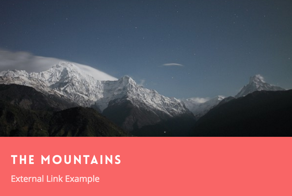
- External Project URL If you would like your project to link to a custom location, enter it here (remember to include “http://”)
- Parent Portfolio Override This allows you to manually assign where your “Back to all” button will take the user on your single portfolio item pages. There’s a global option for this in the Salient options panel > portfolio > functionality tab as well.
- Project Excerpt By default the project date will display under your title in the portfolio grid. However, If you would like your project to display a small excerpt of text under the title in portfolio element instead, enter it here.
- Project Accent Color, Project Title Color, Project Date/Custom Excerpt Color These will be used in the portfolio thumbnail view to alter the color of the given attribute.
Project Header Settings
The header settings for the portfolio post type are similar to the ones in the page post type, only slightly more limited.
- Background Image: Allows you to upload an image that will be shown in the Background of your page header. Since it will be displayed full width, make sure yo supply a decent size image in order to ensure a good viewing experience on desktops. e.g. 1600px wide by 350px tall (or whatever you have for your defined header height)
- Page Header Height: This controls how tall your header will display on desktop displays. Enter the desired value in px but don’t include the “px”. e.g. “350”
- Page Header Subtitle: An optional title which will be displayed smaller under the main title
- Page Header Background Color: Allows you to set an optional background color for the page header
- Page Header Font Color: Allows you to define your own color for the page header title/subtitle – the default is white
The following option will only appear when you have the Use Transparent Header When Applicable option turned on in the Salient options panel > Header Navigation > Transparency tab. To learn more about how the transparent navigation effect works please see this section in the documentation about it.
- Disable Transparency From Navigation: Will deactivate the transparent effect from your header navigation when it would otherwise be enabled due to use a background color or background image on your project header.
Video Settings
These settings are just a quick way to add a self hosted video player into the top of your single project. You can also add a video through the page builder in the main editor.
- Video Height This only needs to be filled out if your self hosted video is not in a 16:9 aspect ratio. Enter your height based on an 845px width. This is used to calculate the iframe height for the “Watch Video” link.
Don’t include “px” in the string. e.g. 480 - Preview Image should be at least 680px wide. Click the “Upload” button to begin uploading your image, followed by “Select File” once you have made your selection. Only applies to self-hosted videos.
- Embedded Code If the video is an embed rather than self-hosted, enter in a Youtube or Vimeo embed code here. The width should be a minimum of 670px with any height.