Because the image gallery element within the Salient visual composer is so powerful and extensive, we felt it was necessary to give it its own section in the documentation.
- Image Source Select how you would like to supply images for your gallery. You can choose to either upload them yourself or provide a list of external links. When using the external links option you won’t be able to take advantage of some of the features anymore such as Masonry sizing and title/caption options in the image grid gallery type.
- Gallery Type How you choose between the gallery/slider styles. Each of these will alter the available options in the gallery to be tailored to the chosen style. For example, Nectar Slider specific options will show for the Nectar Slider, Portfolio specific options will for the image grid type etc.
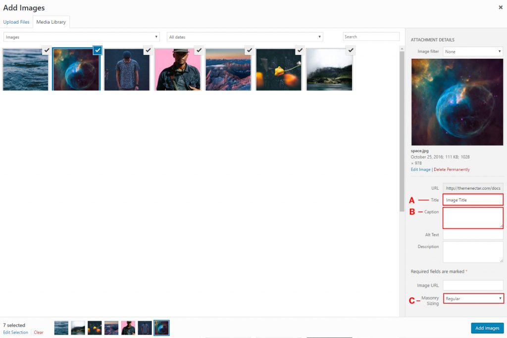
- Images (visible when using the “Media Library” option for your Image Source) This is where you actually upload images for your gallery. Clicking on the green plus icon will bring you to the media library where you can select as many images as you need. When selecting an image the “Attachment Details” sidebar will show up. This is where you can edit the image metadata and set up your title/captions (which can optionally be selected to show with the Image Grid gallery type). Once you’ve made your selection, the images will be added into the image gallery element and you can drag and drop to reorder them whenever needed.
- Image Size Enter your desired size to crop the image to, you can also enter WordPress image size names such as “full”.
- On Click Set whether you’d like to attach a click event to your images in the gallery. Currently you can choose between having no click event, opening a lightbox to display the fullsized image or supplying a custom URL link.
Image Grid
Note: The image grid display is very similar to the Portfolio in Salient as far as styles/layouts. It also uses your selection for “Masonry Grid Sizing“ defined in the Salient options panel > portfolio tab. Please make sure you’re familiar with what that is and the options for it by seeing the relevant section in the documentation.
Making a Masonry Image Grid After turning on the “Masonry Style” option in your image gallery element, open your gallery media library by clicking on the plus sign in the Images option. Next, you’ll see the “masonry sizing“ Shown as “C” in the Add Images screenshot. This dropdown exists for every image you add to your gallery. This field will only show up when you have “Image Grid” selected for your Image Gallery element type.
Note: In order to have a structured grid masonry layout like shown below, you must select either “Fullwidth” or “Constrained Fullwidth” for your image grid layout.
Adding Title/Caption to your image(s) Shown as “A“ & “B” in the Add Images screenshot, use these inputs to optionally add a title/caption to your images. Make sure you also have the


Touch Enabled & Spaced
The touch enabled & spaced gallery is powered by plugin called Flickity. In Salient you get two unique styles to choose from that provide you with either next/prev arrows as shown in the example slider below or pagination dots. When using this slider make sure to always have at least three images because the layout calls for it


Nectar Slider Style
The gallery Nectar Slider gives a quicker way to create a Nectar Slider as it will show in the same style. If you have never used a Nectar Slider before you can get familiar with the options in this section of the documentation, however note that the video options will not be available in gallery instances of it. If you’re trying to use the flexible height option, make sure you’re using the slider within a full width content row to allow it to display full width.
Basic Slider Style
As the name implies, this slider option is a simple option that would work best in a column rather than a full featured slider. The options to customize are limited, but it will always show the images uploaded in there full uncropped aspect ratios which is something to keep in mind. If you’re planning on having different aspect ratios in your slider as the Nectar slider can only display one aspect ratio per instance