Page Header
The page header offers three different background types. Each different type will reveal certain options which are related to that type.
The page header offers three different background types. Each different type will reveal certain options which are related to that type.
Your supplied video will be automatically played on load so make sure to use this option responsibly for enhancing your design, rather than annoying your user. e.g. A video loop with no sound. In order to ensure cross browser compatibility you’ll need to supply both WebM and MP4 versions of your video. OGV is optional.
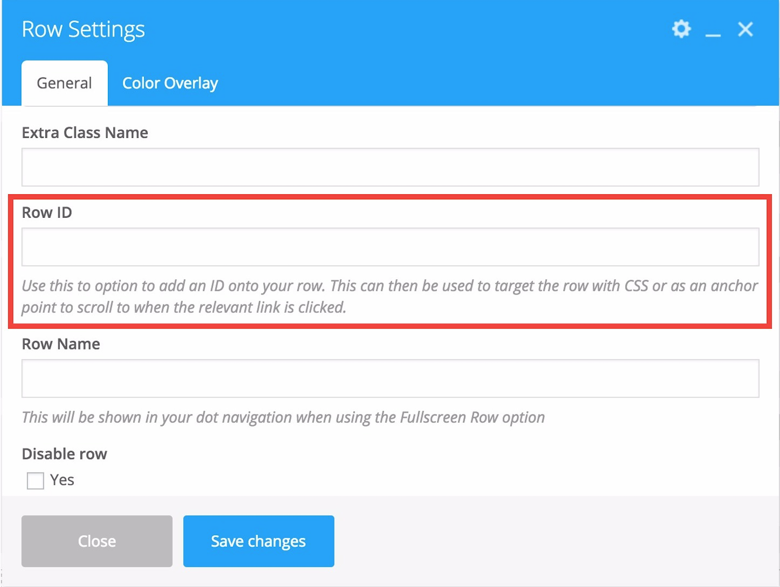
Particle Images This upload field will open a modal that allows you to add images to your particle display via the WordPress media gallery interface. Please see the tutorial below for more information on configuring your particle header
Note: Having a background color/image set tells the theme that you’re intending on using the page header and it will display regardless if you’ve deleted the supplied title. Sometimes users wish to no longer use a page header but forget to delete the Background color they’ve set and can’t figure out what’s causing the page header area to remain.
The following two options only appear when you have the Use Transparent Header When Applicable option turned on in the Salient options panel > Header Navigation > Transparency tab. To learn more about how the transparent navigation effect works please see this section in the documentation about it.
The page full screen row option will turn all of your rows in the Salient Visual Composer page builder into fullscreen sections which will be scrolled between remaining always 100% in view. There’s many configuration options pertaining to the animations and general styling which will be listed below. Salient also provides multiple demos showing off this feature which can be seen here:
If you’re the visual learning type or just want to see mr. Nectar configure some sections to get a better feel for the page full screen rows, please check the video tutorial below!