- Use Image for Logo If left unchecked, plain text will be used instead (generated from site name).
- Logo Upload An upload field which allows you to add an image which will be used for your website logo
- Retina Logo Upload Supplying this will keep your logo crisp on screens with a higher pixel density. Upload at exactly 2x the size of your standard logo.
- Logo Height add the desired height you would like your logo image to display at. Don’t include “px” in the string. e.g. 30
- Mobile Logo Height The same as the field above, but will only apply on mobile devices
- Header Padding Allows you to define the amount of space between your logo/navigation items and the top/bottom of the header. The default for this if left blank is 28.
- Header Sticky On Mobile This option will keep your header navigation bar fixed at the top on mobile devices if active.
- Header BG Opacity allows you to set the opacity of your header navigation. Note this is not the option to use to create the fully transparent header seen on most of the demos when scrolling to the top of the screen – this is only meant to reduce the opacity to a semi transparent state, which could be used in addition to the actual transparent header option if desired. If you’re looking to have the 100% transparent top navigation bar, see the transparency section in this chapter.
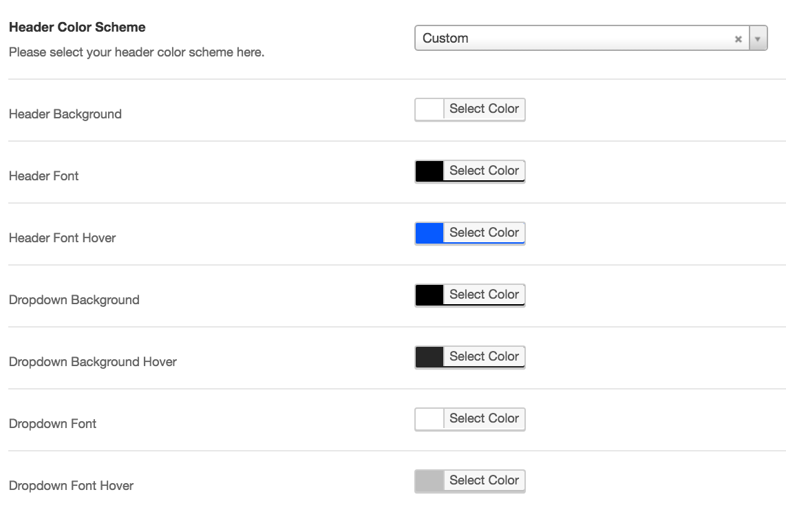
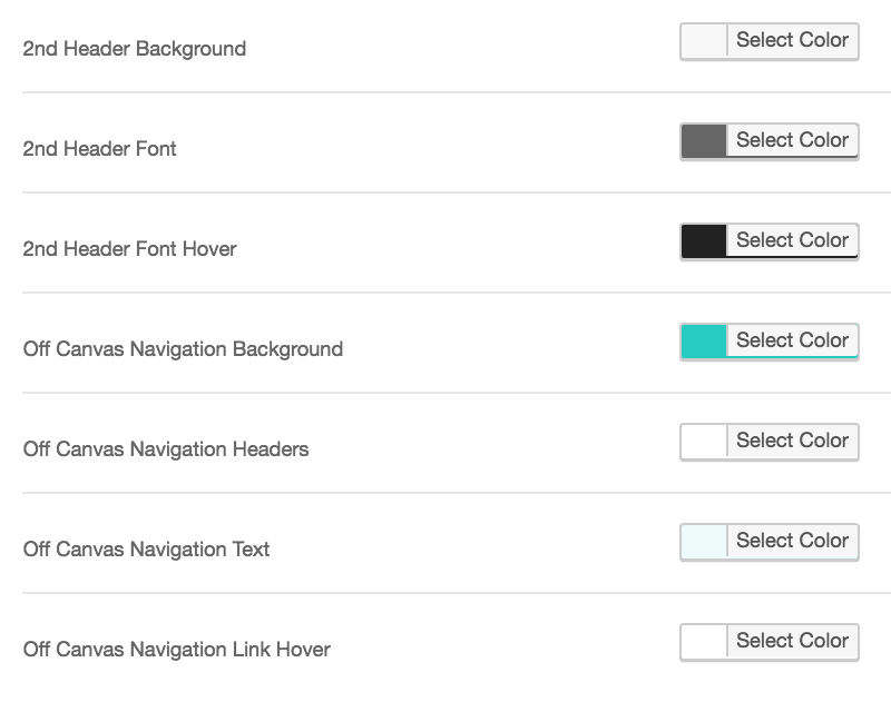
- Header Color Scheme Allows you to set the color scheme or define your own for your header navigation bar. By selecting “custom” for the color scheme you’ll have color pickers for everything related to the header, including the off canvas navigation.
Layout Related
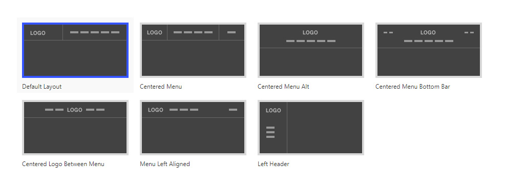
- Header Layout
- Full Width Header Allows your header to extend the full width of user’s screen size
- Remove Header Search Use this to remove the search icon/functionality from displaying in your header navigation
- Disable AJAX From Search Check this box to remove the AJAX autocomplete suggestions from appearing in your header navigation search box
- Enable Social Icons Enabling this will reveal a selection of social icons you can choose from to display in your header navigation. If you have the secondary nav active they will display in there, if not then they will display in the main header navigation. You can configure the URL for each of the icons in the Salient options panel > Social Media tab.
Secondary Header Bar
- Secondary Header Bar This option allows you to toggle the secondary navigation bar which will appear above your regular header navigation.
- Secondary Header Text Add the text that you would like to appear in the secondary header.
- Secondary Header Link URL Please enter an optional URL for the secondary header text here.
- Secondary Header Mobile Functionality Determines how the secondary header bar to display on mobile devices. By default, the mobile menu will inherit all of the secondary header items, however there is the option to prevent that and continue to show the secondary header on all devices. Note: The option to “Display Items Above Mobile Header” will be skipped when using the “Header Permanent Transparent” option in the Header Navigation > Transparent Effect tab.
Transparency
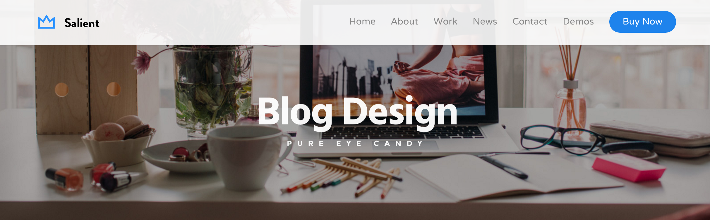
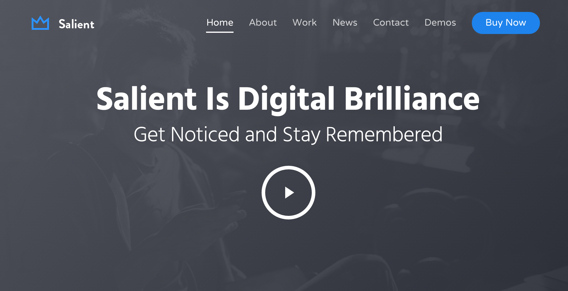
- Use Transparent Header When Applicable If activated this will cause your header navigation to be completely transparent before the user scrolls (see below image). Valid instances where this will get used include using a Page Header or using a Full width/screen Nectar Slider at the top of a page. There is also an option to Force Transparency On Navigation, which is available on a page by page basis in the page header metabox.
- Header Starting Logo Upload This will be used when the header is transparent before the user scrolls. (Will be swapped for the regular logo upon scrolling).
- Header Starting Retina Logo Upload a field that will allow you to supply a Retina version of your logo which will be used on devices with a higher pixel density
- Header Starting Dark Logo Upload This will be used when either of the following two conditions are true:
- A row is set to dark for the text color and the Header Permanent Transparent header option is on
- a Nectar Slide is set to use the dark text color and the header transparency is active from the Use Transparent Header When Applicable option
If nothing is uploaded, the default logo will be used.
- Header Starting Dark Retina Logo Upload The retina version of your dark logo can be supplied here
- Header Starting Text Color The color that your menu items will display in when the transparent header navigation is in effect i.e. either at the top of the page before the user scrolls, or on any light colored rows if using the Header Permanent Transparent option
- Header Dark Text Color The color that your menu items will display in when the Starting Dark Logo is visible, see the above guidlines for Header Starting Dark Logo Upload
- Header Permanent Transparent If a page triggers the header transparent effect, this option will cause the transparent effect to remain active for the entire page and switch between the header starting logo & header starting dark logo depending on what your page builder rows are set to for their text color
- Header Inherit Row Color Turning this on will allow your header to take on the background & text colors of the row that it passes. (Ideal for one page sites)
- Remove Border On Transparent Header Turning this on will remove the border that normally appears with the transparent header
Animation Effects
- Header Link Hover/Active Effect Currently there’s two options available: Animated underline & Color chnage


- Header Hide Until Needed This option hides your header navigation bar after the user scrolls down the page from the top. It will be shown again whenever the user scrolls inthe upward direction or if the user reaches the very end of the page
- Header Resize On Scroll This will cause your header to shrink a little when the user scrolls down the page from the top. Turning this on will reveal a new input where you can define how much you would like it to shrink by
Note: All the header resize effect is changing during the animation the header padding and logo height fields in the Logo & General Settings tab. Some new users have asked how to get the header to be as small as the header after the resize effect all the time – for this, just change the above listed fields to whatever you desire.
Off Canvas Navigation/Mobile Menu
- Off Canvas Menu This determines whether or not the Off Canvas Menu will be shown in your header navigation on desktop monitors.
- Off Canvas Menu Style the available styles for your off canvas menu. Please see examples of each style below. Do not pay attention to colors or font selections, as those will change depending on your own settings – instead, focus on the overall layout.

Slide Out From Right
With Material Theme Skin Active. When opened, the site will appear to shrink and push off screen, revealing the menu from underneath. This is the latest and most eye catching choice.

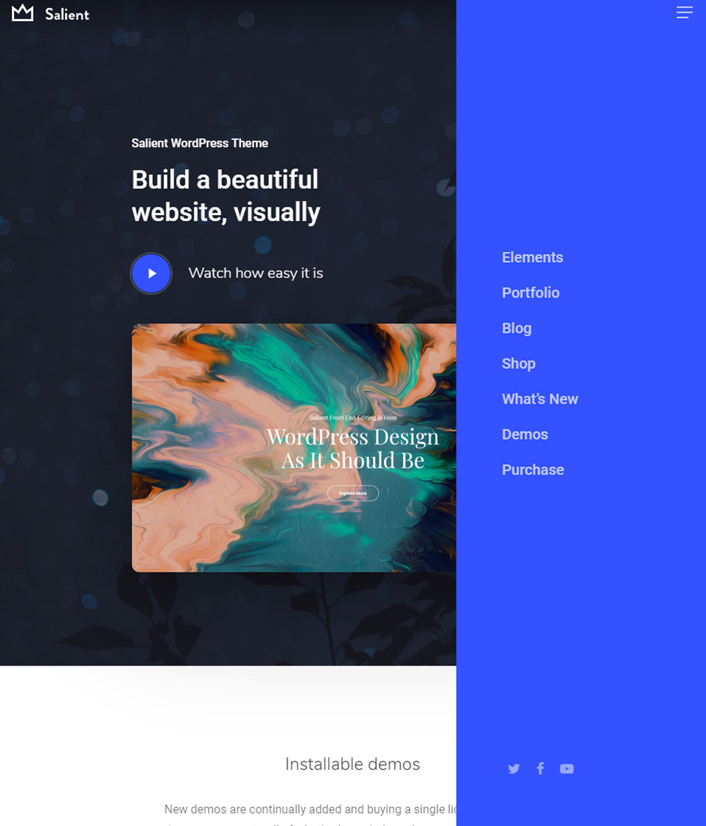
Slide Out From Right
With All Other Theme Skins Active. When opened, the site will entirely push to the left to make room for the menu.
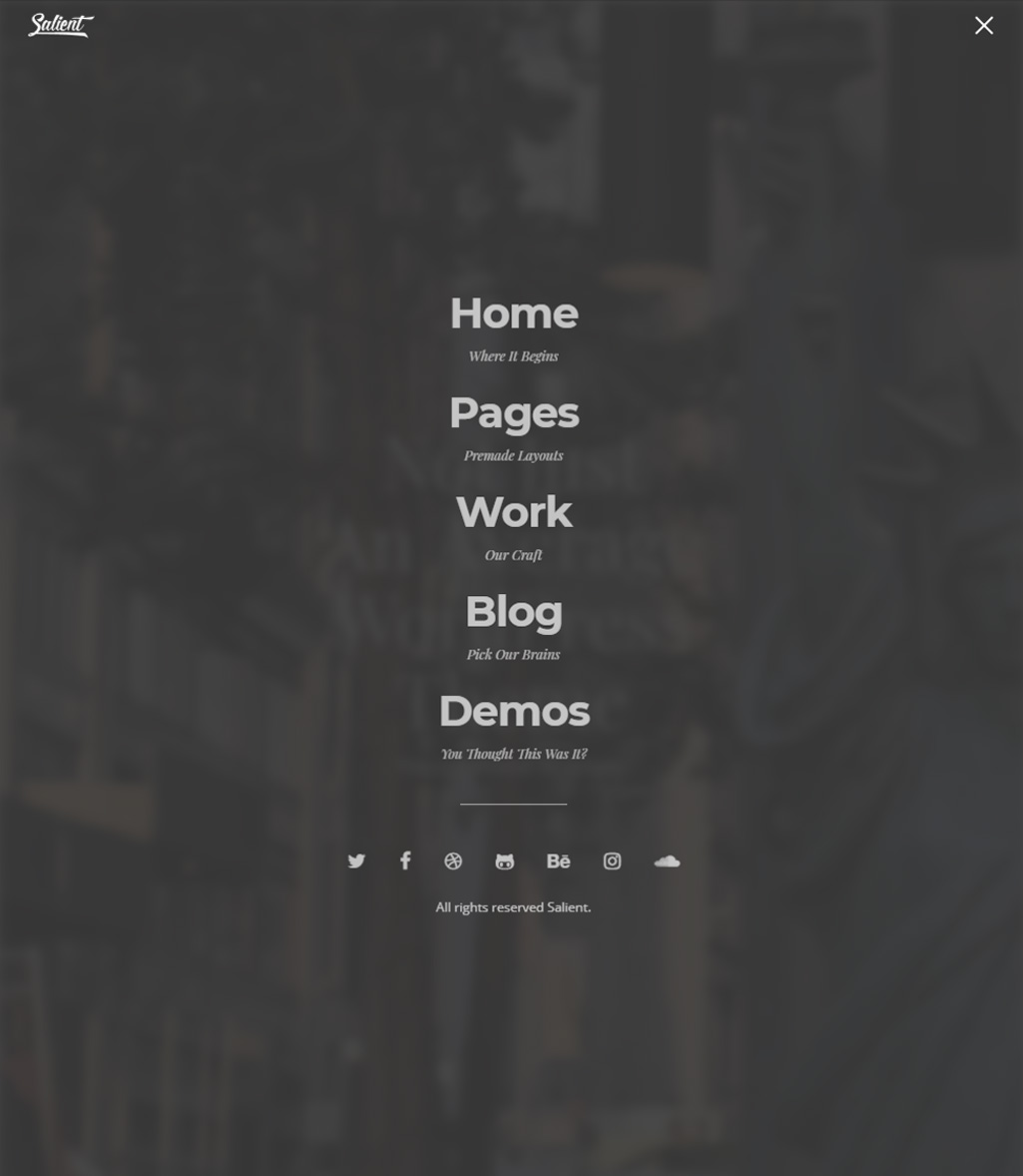
Fullscreen Cover + Blur BG
The menu will cover the entire screen, overlaying on top of all content and blurring everything behind it.
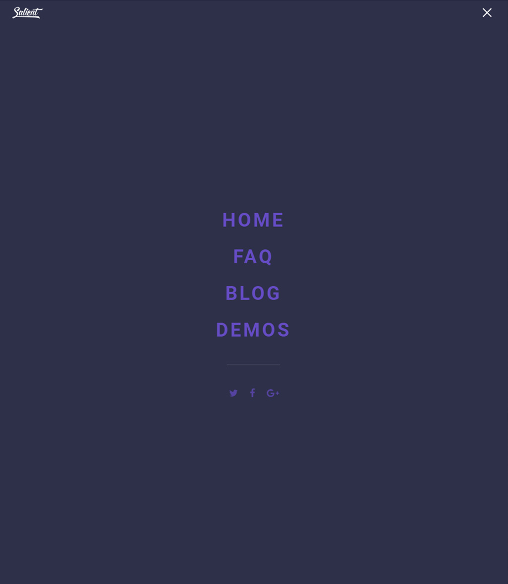
Fullscreen Cover + Blur BG
Similar to the other fullscreen style, but higher performing in since there’s no background blurring involved.
Slide Out From Right Hover Triggered
The menu will open as soon as it is hovered over. Does not move the site content, and adds a cool menu icon animation when opening/closing.

Simple Dropdown
New for v10.5, this style offers a classic mobile menu feel with flexibility. The coloring will inherit from the header navigation, making it seamlessly fit in with any design.
- Off Canvas Menu Add Social This will add the social links which you have set in the Social Media tab of the Salient Options Panel into your off canvas nav
- Off Canvas Menu Bottom Text Allows you to add additional text to your off canvas nav which will be postioned at the bottom
- Off Canvas Menu Overlay Strength Defines how dark the off canvas overlay background will be
- Off Canvas Menu Mobile Nav Menu Items This will cause your off canvas menu to inherit any navigation items assigned in your “Top Navigation” menu location when viewing on a mobile device. Useful for consolidating two separate menu areas set to display on desktop to avoid two different menu icons on mobile