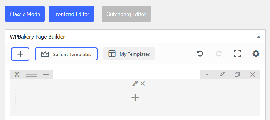
To open up column settings, click on the pencil icon located in the middle of a column.
Spacing & Content
Responsive Options
Background
Color Overlay
Structure
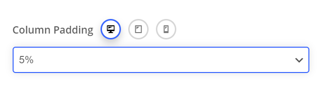
Padding
Allows you to define how much padding you would like from a percentage dropdown. Percentage values are used to keep everything responsive. Using padding will help give the content nested inside the column breathing room and allow the background layer of your column to show more.
Device Groups
The three icons next to the field name allow you to define separate values for the desktop/tablet/smartphone views.
Padding Position
The padding position dropdown allows you to add the padding to a specific side, or combination of sides on the column.
All Sides
Lorem ipsum dolor sit amet, consectetur adipiscing elit. In eget eros molestie, iaculis.
Top/Bottom
Lorem ipsum dolor sit amet, consectetur adipiscing elit. In eget eros molestie, iaculis.
Left Right
Lorem ipsum dolor sit amet, consectetur adipiscing elit. In eget eros molestie, iaculis.
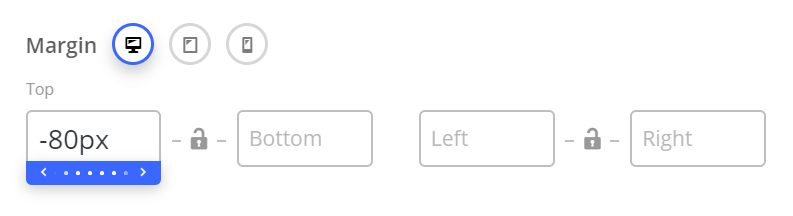
Margin
Allows you to create space around a column by a specific margin (top,bottom,left,right) of your choosing. Negative values are also accepted and can be used to pull columns outside their default flow.
60px Top Margin
Lorem ipsum dolor sit amet, consectetur adipiscing elit. Aenean ac ex a enim dapibus imperdiet. Morbi laoreet ipsum vitae suscipit consectetur. Suspendisse varius nulla id augue imperdiet,
No Margin
Lorem ipsum dolor sit amet, consectetur adipiscing elit. Aenean ac ex a enim dapibus imperdiet. Morbi laoreet ipsum vitae suscipit consectetur. Suspendisse varius nulla id augue imperdiet,
Centered Content
The centered content option is a fast way to center all text and inner elements of a column. Note: Certain elements will not respond to this option – in those cases, the elements will have their own settings for alignment.
Centered Content Enabled
Lorem ipsum dolor sit amet, consectetur adipiscing elit. Ut elit tellus, luctus nec ullamcorper mattis, pulvinar dapibus leo.
Centered Content Disabled
Lorem ipsum dolor sit amet, consectetur adipiscing elit. Ut elit tellus, luctus nec ullamcorper mattis, pulvinar dapibus leo.
Column Link
Adds a link over your entire column to your specified URL.
Note that when using this, hover effects on any elements within the column will no longer be triggered.
Responsive Options
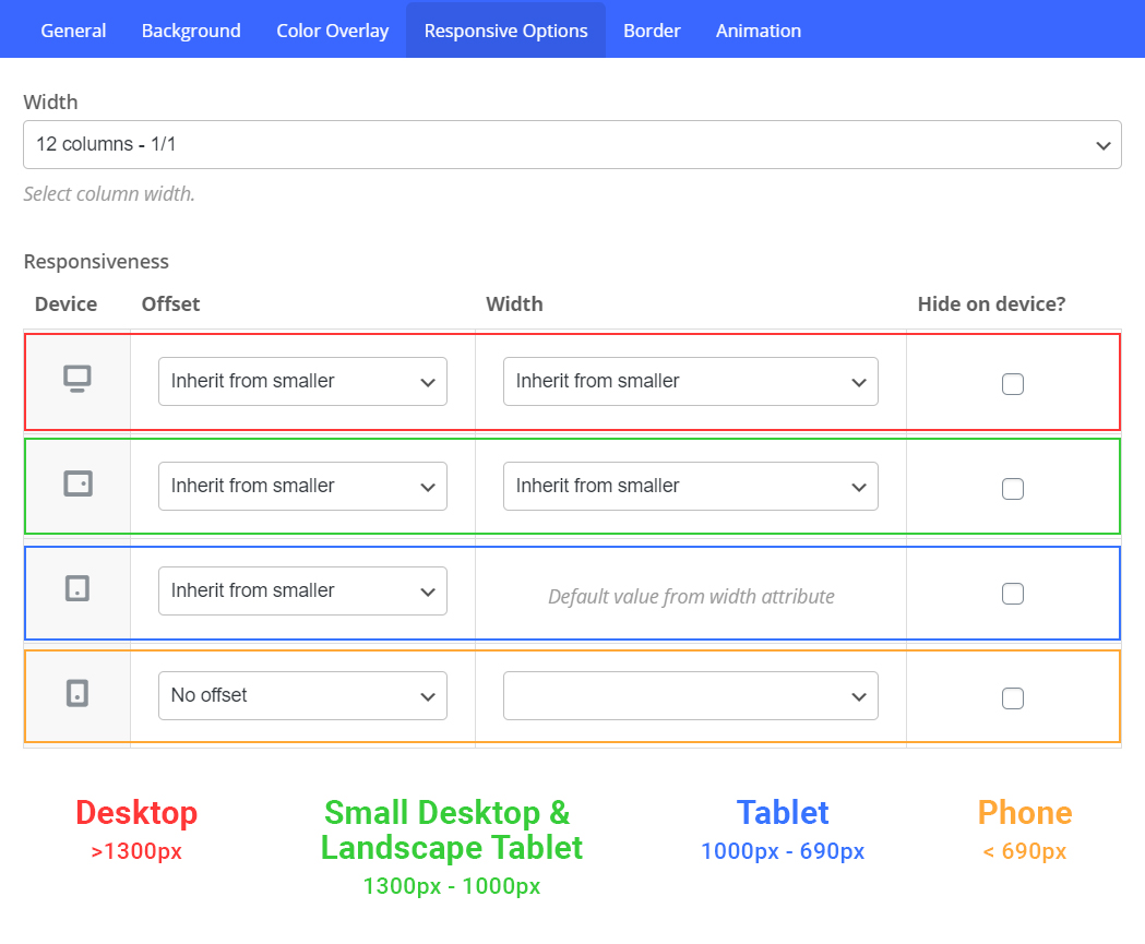
Overview
The Responsive Options tab allows you to define the size/position you want your column to display at in each viewport. By default, a column will display at 1/1 (100%) in tablet/phone viewports. You can easily override this to create the column setup desired by using the following options.
Width
The width field will set your column to a new width on the specified device. Let’s use an example of having three columns (1/3) on desktop and assume that we want them to remain as 1/3 for mobile viewports as well. To accomplish that, we simply set the width to be 1/3 on all viewports.
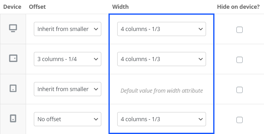
You may have noticed that the tablet viewport does not allow you to define a custom width – This is a default limitation within WPbakery. However, we’ve added an option specific to Salient that allows you to work around it. To specify where your column width inherits from on tablet, you can use the dropdown labeled “Tablet Column Width Inherits From“, which is located directly under the responsive options table.
Offset
The offset field allows you to move your column from its default position by a specified amount. While it’s not used as frequently as the “width” dropdown, there are two scenarios in which you’ll find yourself using this field.
- You’ve set one of the columns in your row to hide on a specific device, and need to offset a column that’s still visible in order to center it.
- You’ve specified column widths that equal larger than 1/1 and are pushing a column onto a new “row”. For example, let’s say you had three columns (1/3) on desktop, and on tablet you set each of the widths to a new custom value of 1/2. This would push the third column onto a new row, which could be centered by using a 1/4 offset.
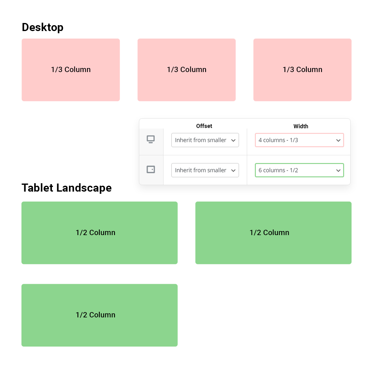
The third column in the row is now left aligned, but what if we would like it to display centered?
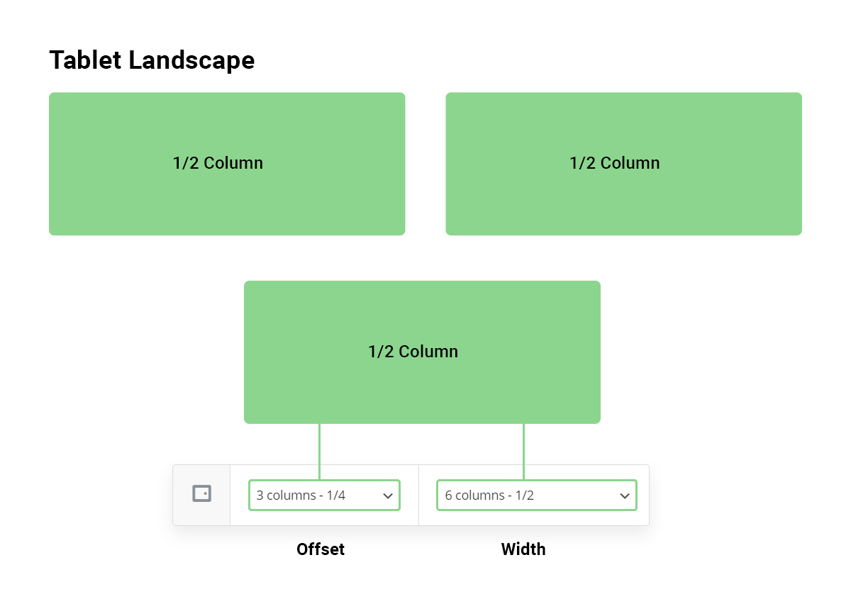
With a column offset added, the third column can now remain centered
Hide On Device
This option allows you to hide a column from displaying on a given viewport. The column will be hidden using CSS and still exist within the HTML structure.
Background
Background Layers
The stacking order for the background layer can be seen in the illustration below.
- Elements place inside the column (top)
- Color Overlay Layer
- Background Color
- Background Image/Video Layer (bottom)

Background Image
You can add a background image to any column by using the “Upload image” button in the background tab of your column settings. Once an image is supplied, some new options will appear which relate to the display of your background image.
- Background Position: Define an alignment for your background image within the row. By default, the image will be anchored to the left top of the row.
- Scale Background Image To Column: Automatically adjusts the image to fit the size of your column. This option is recommended in most cases, unless If you’re trying to use a pattern that is meant to repeat.
With Scale Background Image Disabled
With Scale Background Image Enabled
Video Background
- WebM File URL: If you’re self hosting, you must supply this format to ensure cross browser compatibility.
- MP4 File URL: If you’re self hosting, you must also supply this format to ensure cross browser compatibility.
- OGV File URL: Optional file format to supply for self hosting
- Video Preview Image: The image that will be used in place of your video BG on mobile devices. This is only used when you have the Salient theme option “Disable Video Backgrounds On Mobile Devices” activated. (Salient options panel > general settings > functionality tab).
Troubleshooting self-hosted video background playback
Videos won't play on desktop or mobile
Ensure that your server is capable of parsing video files. Some servers require you to add the media types supported in the .htaccess file in order for them to parse the files. Open up your .htaccess file located at the root of your WordPress install and add this in:
AddType video/mp4 .mp4
AddType video/mp4 .m4v
AddType video/ogg .ogv
AddType video/webm .webm
AddType video/webm .webmv
If unsure that your server is configured to playback videos correctly, try inputting a video hosted from ThemeNectar and test playback:
https://themenectar.com/videos/video-test.mp4
Ensure that your videos are correctly encoded for web playback. If you’ve added the media types to your server and are still running into difficulty, please run your videos through these converters:
http://video.online-convert.com/convert-to-mp4
http://video.online-convert.com/convert-to-webm
Videos won't play on mobile only
Ensure that a power-saving or data-saving mode is not on: If a power-saving mode is active, it will prevent ANY video from auto-playing. Because of this, it’s recommended to still supply a fallback image for these instances.
Background Color
In columns, the background color layer sits on-top of the background image. This is to provide the ability to animate the opacity on hover over the image.
Background Color
- Opacity: 1.0
- Hover Opacity: 1.0
Background Color
- Opacity: 0.5
- Hover Opacity: 0.5
Background Color
- Opacity: 0.8
- Hover Opacity: 0.4
Color Overlay
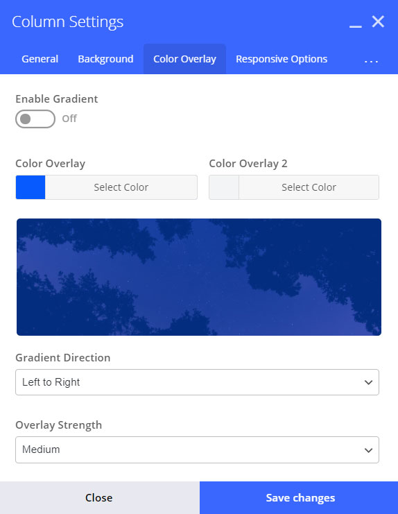
Gradient Direction
Controls which way to render the gradient – A preview will be shown in the overlay tab.

Left to Right

Left Bottom to Right Top

Left Top to Right Bottom

Bottom to Top
Animation
Enabling animations on mobile devices
As of Salient version 12, you can now have your elements animate on mobile as well. To enable this functionality, head to the Salient options panel > general settings > functionality tab, and change the option titled “Page Builder Element Animations On Mobile Devices” to “Enable.“

